


Additional Information
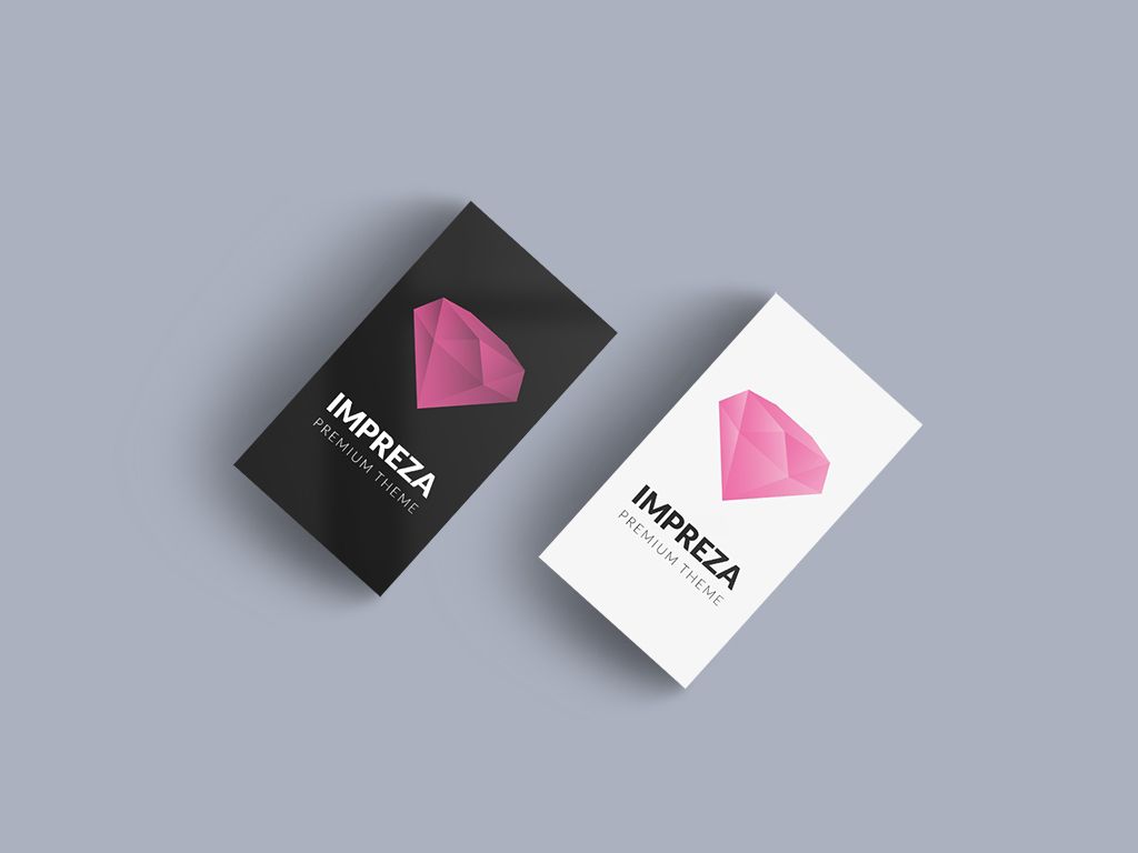
This identity project centred on a refined grey palette for a stationery brand that wanted to look understated but unmistakably premium. We started with a short discovery phase to map how the cards would be used in person, then designed a system that holds up equally well in print and on screen.
The result is a quiet, confident set of business cards built around generous spacing, soft greys, and a single restrained accent. Every detail, from the paper weight to the edge finish, was chosen to reinforce the same sense of calm professionalism.
We handed off print-ready files alongside digital mockups the client could use for pitches and social posts, so the new look was ready to roll out across every touchpoint from day one.